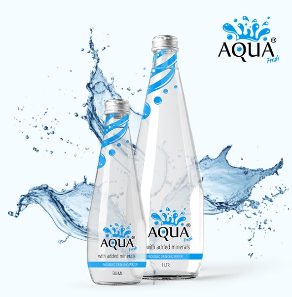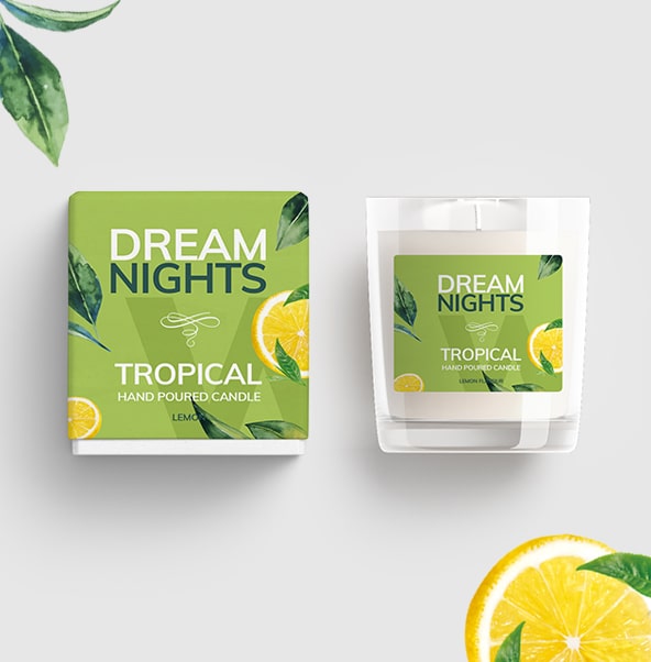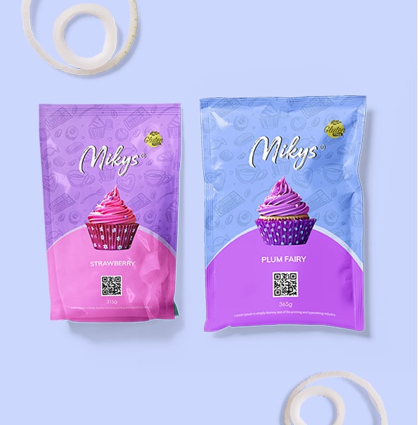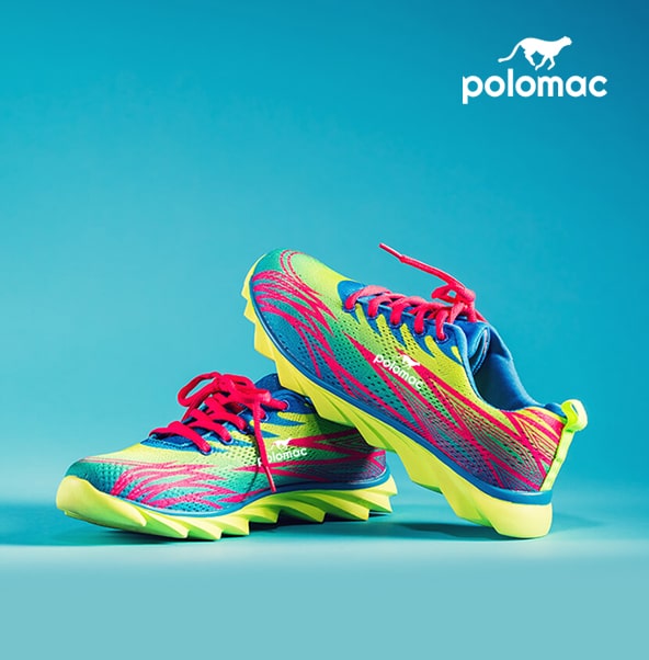
Polomac
The upscale brand was very much influenced by the modern marketing strategy, which did demand them to bring some new looks to their brand.
Know More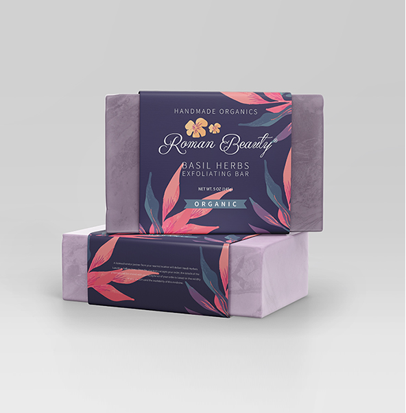
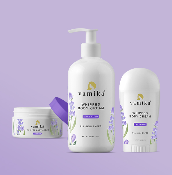
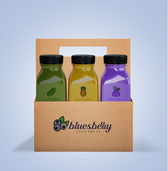
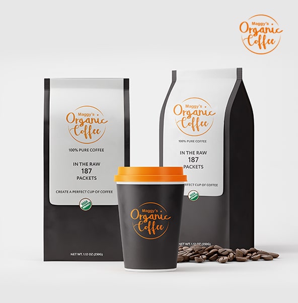
Roman Beauty
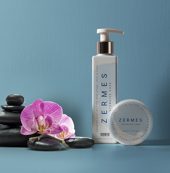
Classy and extraordinary design is what was in the brains while designing the cover of Roman Soap. The design portrayed the quality of the product as well as the identity of the brand.
Know More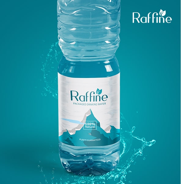
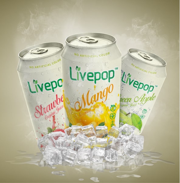
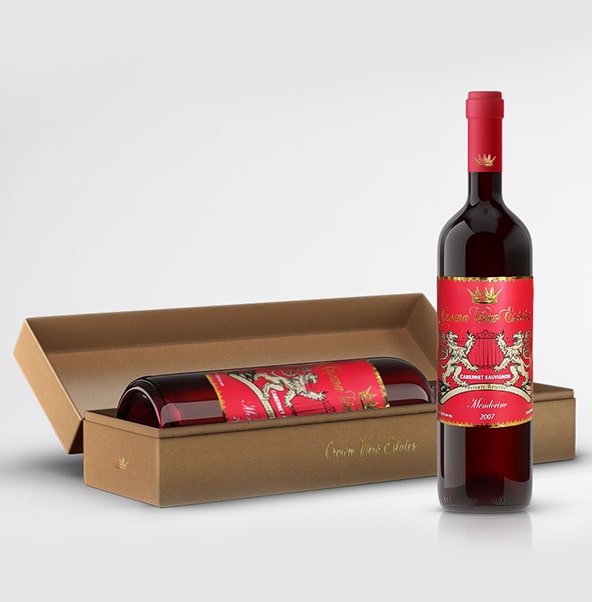
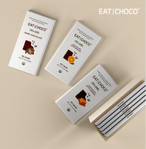
Raffine
To taste the uniqueness and a strong shelf presence, Raffine decided to go for a revamped look that is inimitable.
Know More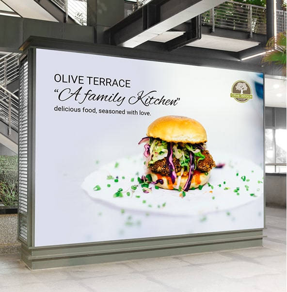
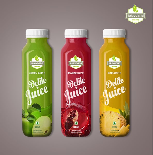
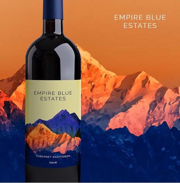
Olive Terrace
Olive Terrace Bar & Grill is Santa Clarita's newest destination for friends, families, and large groups to enjoy homemade pasta, seafood and the best kabobs in town.
Know More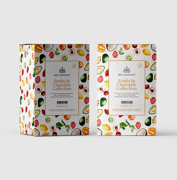
Bellmount
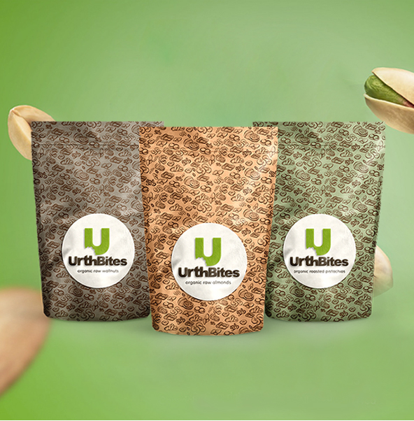
The outer cover of Bellmount is entirely different from all other Dry Fruits Brands. The cover designing was done in such a way that it could grab the attention of the customers at first glance.
Know More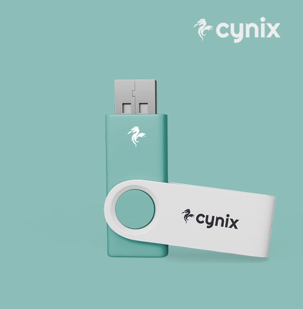
Cynix
Cynix wished for a more generic appearance that would make it vibrant and unique in the world market. It did help them with steep growth in the business.
Know More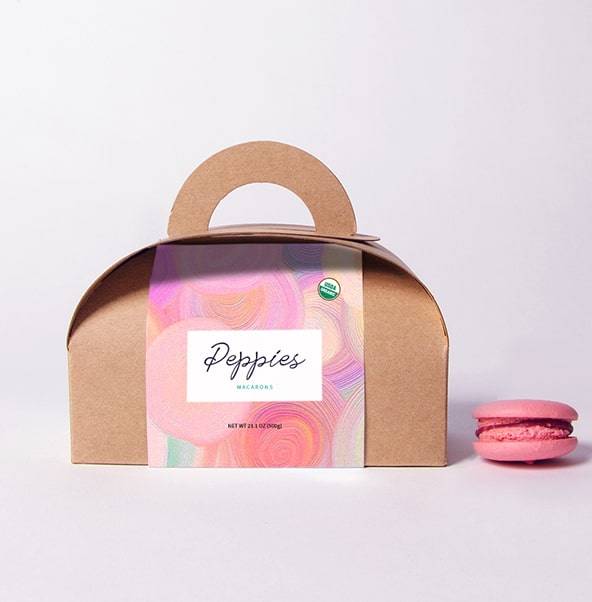
Peppies
The designing of Peppies was planned in such a way that could bring an identity to their brand. We are glad that we could succeed in fulfilling the desire of the brand.
Know More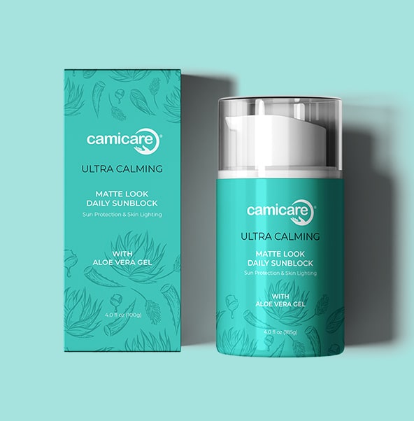
Camicare
Classy and extraordinary design is what was in the brains while designing the cover of Roman Soap. The design portrayed the quality of the product as well as the identity of the brand.
Know More