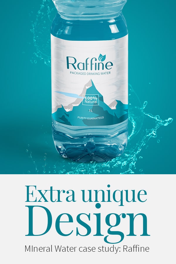
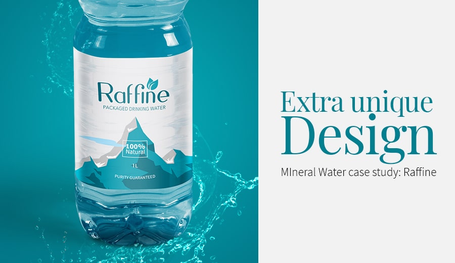
Extra unique DesignMineral Water Case Study: Raffine
Stays in sync with the Design
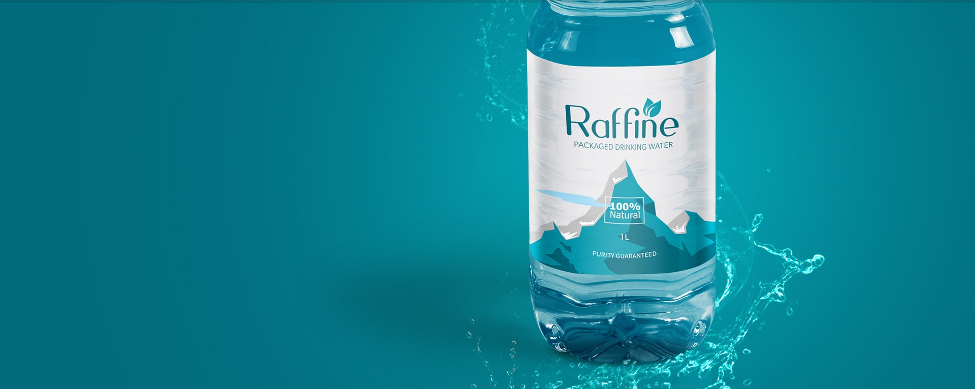
Raffine has grown to be linked with emotions which made people love Raffine a little more than yesterday. We are our uniqueness, which we say with confidence. A dynamic source of packaged drinking water is what Raffine is. In fact, the only brand that can claim it. Raffine proudly stands for strength, longevity, endurance, purity, and nature.
A Splash Creator
Raffine always wanted to be iconic. Streamlining Raffine’s visual identity was the way out. And finally, our brand cornerstone was redesigned to a hyper-real and inimitable aqua. While the previous palette had many colors, the new one has the vibrant blue of the Raffine native foliage. The aqua had to be strong and prominent, for which a fluid, rounded custom typeface and clear label were given.
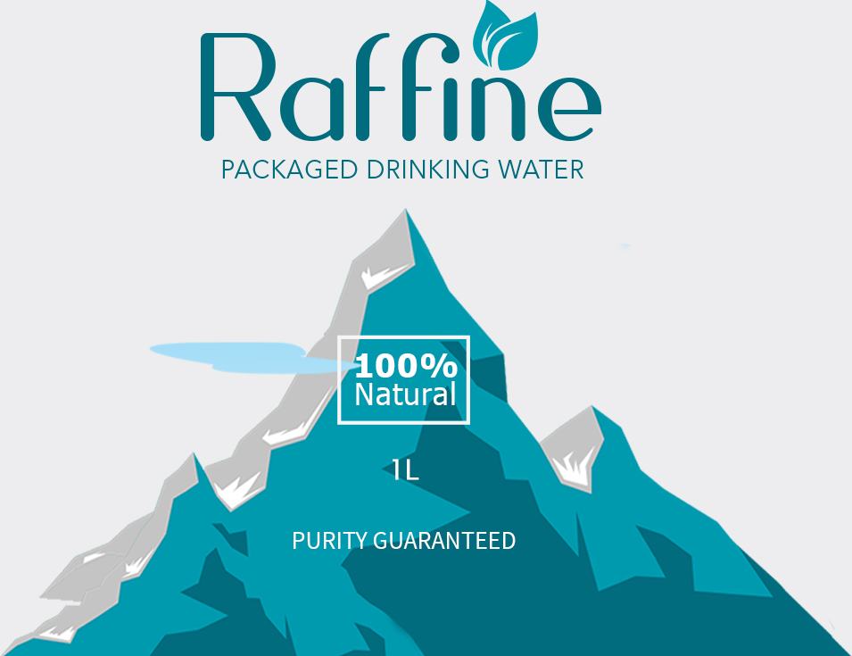
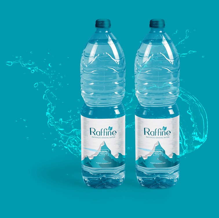
The Revamped
Look for
Raffine Label
Raffine had to be iconic to become real. Streamlining our visual identity was a new idea. The brand’s cornerstone was modified to be hyper-real and inimitable. For a strong shelf presence, a fluid, rounded custom typeface was given which gave prominence for Raffine than before.
Results
The new refreshed look of Raffine was welcomed with open hands by shoppers. Our customer circle expanded to 500,000 in just a year in California alone. The sales across the USA rose to 135 million liters.
“Raffine was in a doubtful stage about the design and identity of the brand until TRIXMEDIA came into the scenario. Thank you TRIXMEDIA for the wonderful output you have brought that could clear all our confusion.”
- Ema Warnobe,
Founder, RAFFINE

9157